Livonia Partners
Helping a pan-Baltic leader tell a stronger story to European LPs
In private equity, your pitch book is more than a presentation. It’s a first impression, a positioning tool, and a statement of intent. For Livonia Partners, preparing to raise Fund III, the goal was clear: create a deck that reflected the firm’s maturity and regional leadership, one that could confidently compete in the European fundraising landscape.
Our role
Pitch book design
PowerPoint template creation
Location
Tallinn
Riga
Vilnius
The Challenge
With over a decade of experience and a growing portfolio across the Baltics, Livonia Partners had the credibility and performance LPs look for. But their presentation materials told a different story.
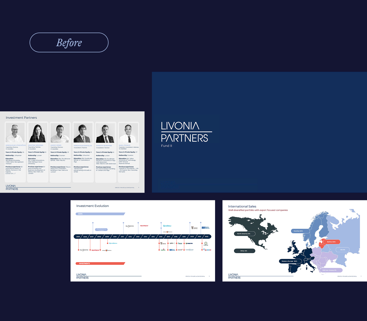
The Fund II deck, designed before the firm’s rebrand, had grown outdated, heavy on corporate blue and light on energy. Since then, Livonia had introduced a vibrant new identity, a beautiful website, and fresh collateral like an ESG report. Visually, they were headed in the right direction. But their investor presentation lagged behind. The firm needed a deck that matched their growth, reflected their brand, and crucially, felt credible to sophisticated European LPs.
From the outset, Partner Kaido Veske set a high bar: “I’m a strong believer in great design. It’s really important to me that it doesn’t just look good, but that it feels right and performs.”
The solution
Despite Livonia having an established brand system, we kicked off with a Design Workshop, a step we believe makes all the difference. It allowed us to listen deeply, push creatively, and translate the firm’s ambition into two distinct design directions. That’s our superpower: turning any brief, however defined, into a vision of what’s possible.
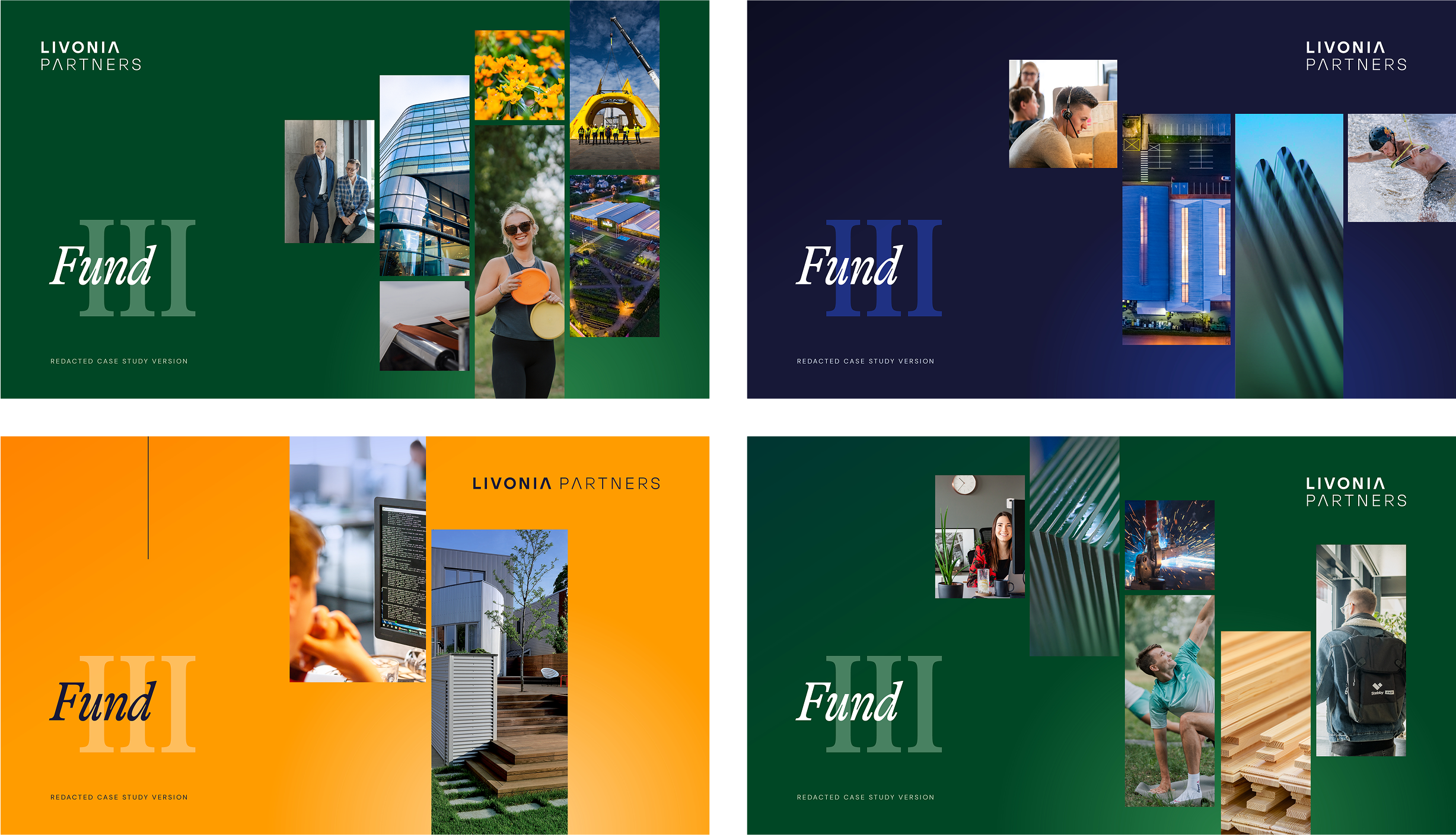
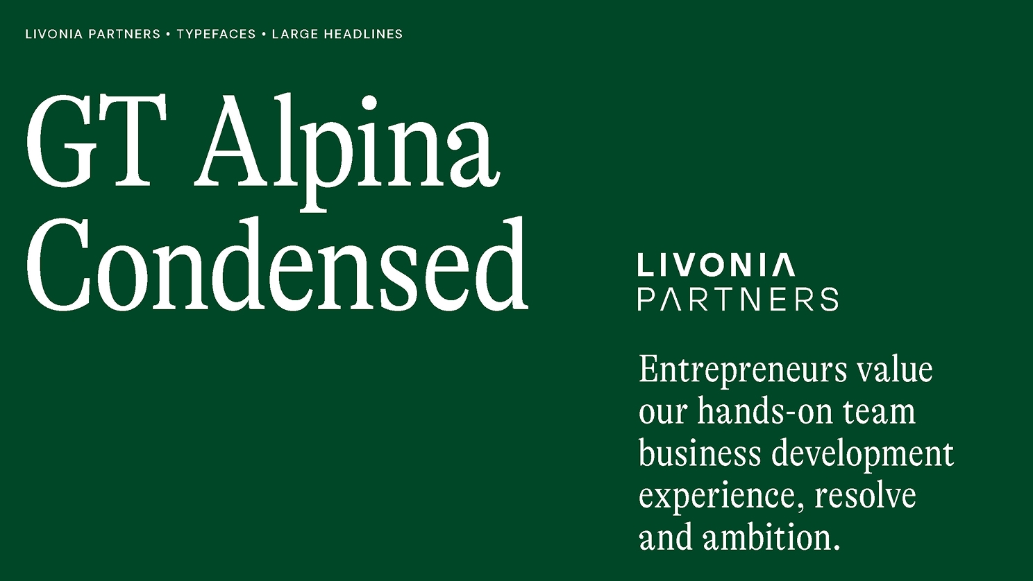
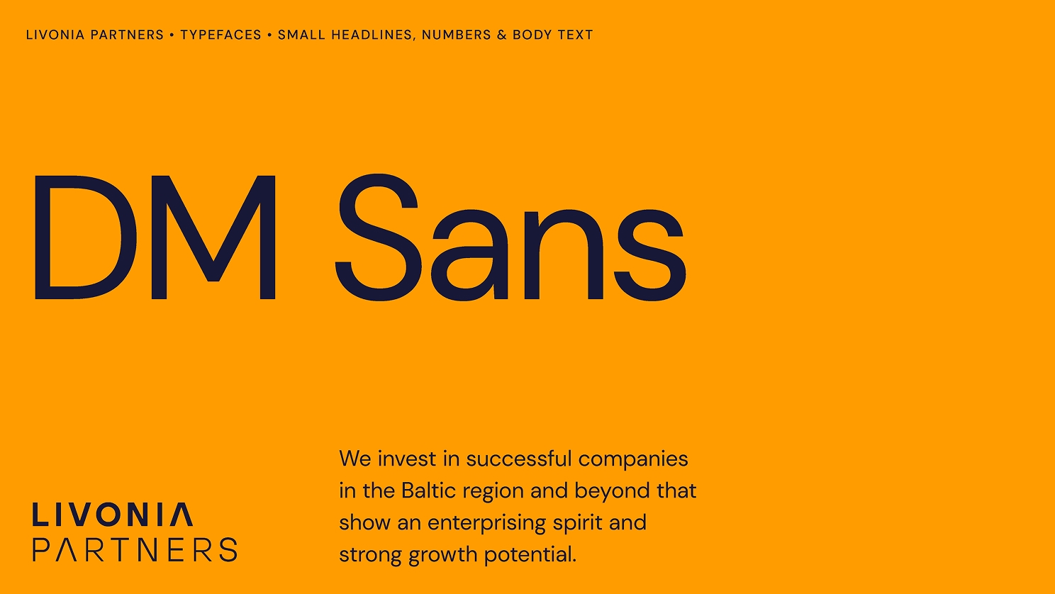
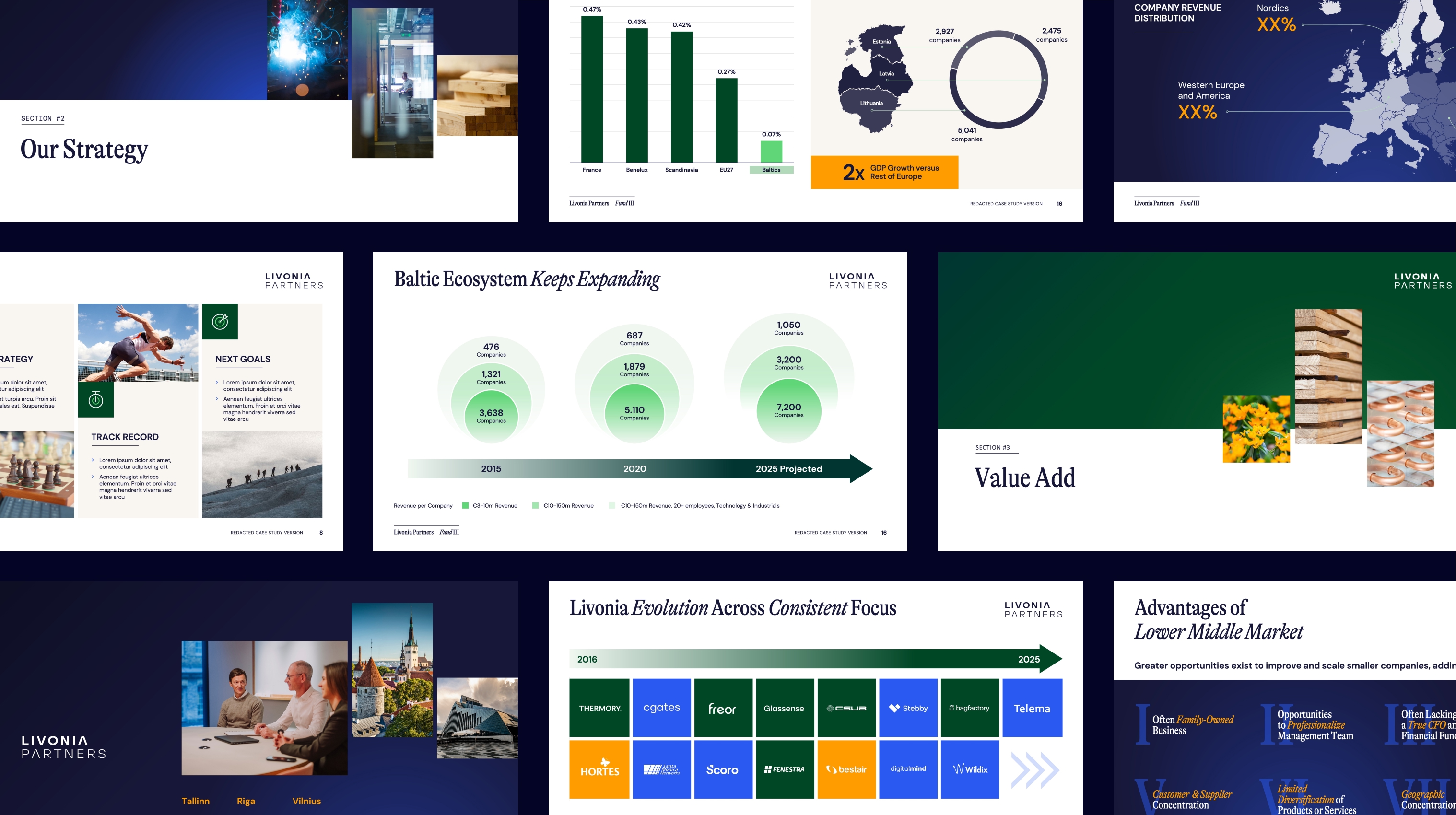
The selected direction built on the strength of Livonia’s identity while sharpening it for investor communications. A refined type system (GT Alpina, DM Sans, Ingram Mono) brought structure and warmth, while a Baltic-inflected palette, deep green, surf blue, moss, and ochre, added energy and focus. Blue elements highlighted Livonia’s technology exposure, while golden tones marked their consumer-linked investments.
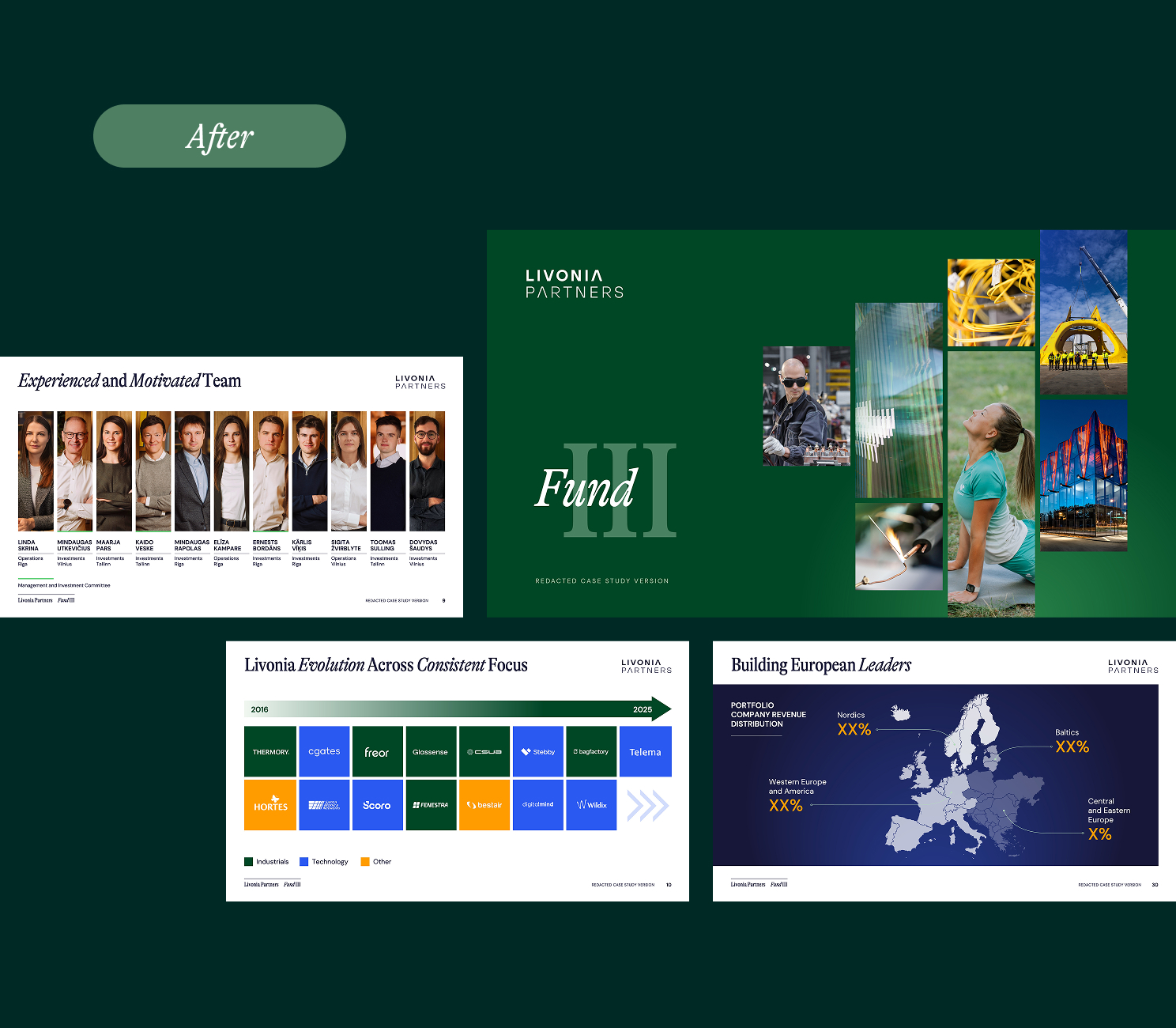
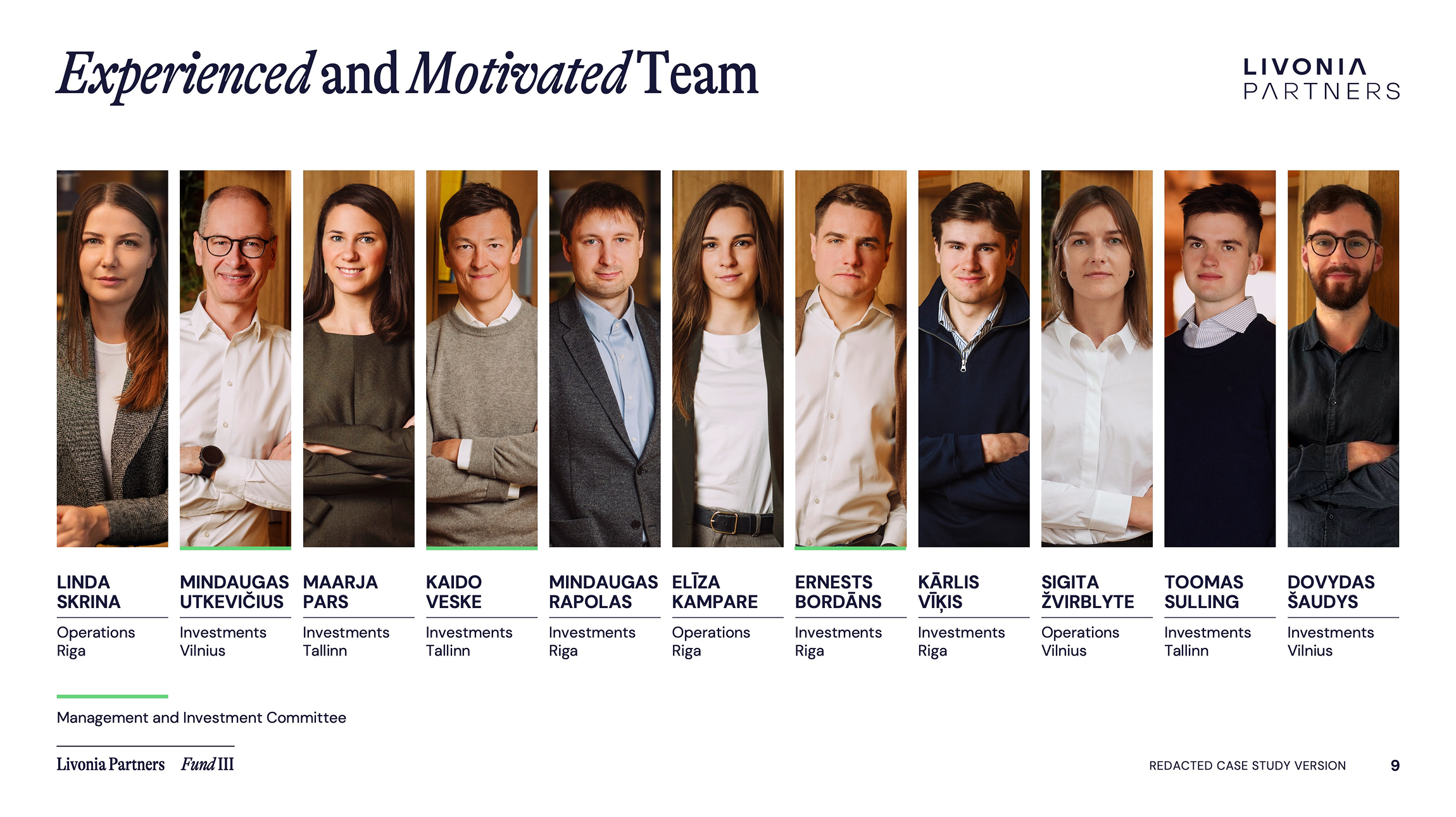
We redesigned 35+ slides around a clean narrative arc: Strategy, Track Record, Value Creation, ESG, and Market Position. Charts and maps were reimagined for clarity. Portfolio visuals were structured by sector and year. Team slides introduced human warmth without sacrificing professionalism.
The new design system combined precision with personality and finally gave Livonia the credible, beautifully executed deck their brand deserved.
The Outcome
The resulting pitch book now matches the caliber of Livonia’s strategy and investor dialogue. It reflects the firm’s transformation and makes their message easier to absorb, easier to trust, and easier to remember.
Beyond a successful Fund III launch, Livonia now has a robust visual system in place for future communications and a template that scales with them.
Project credits
Next Case
Excelsior Energy Capital


