Logos and Marks
Collection of logos within private equity & beyond
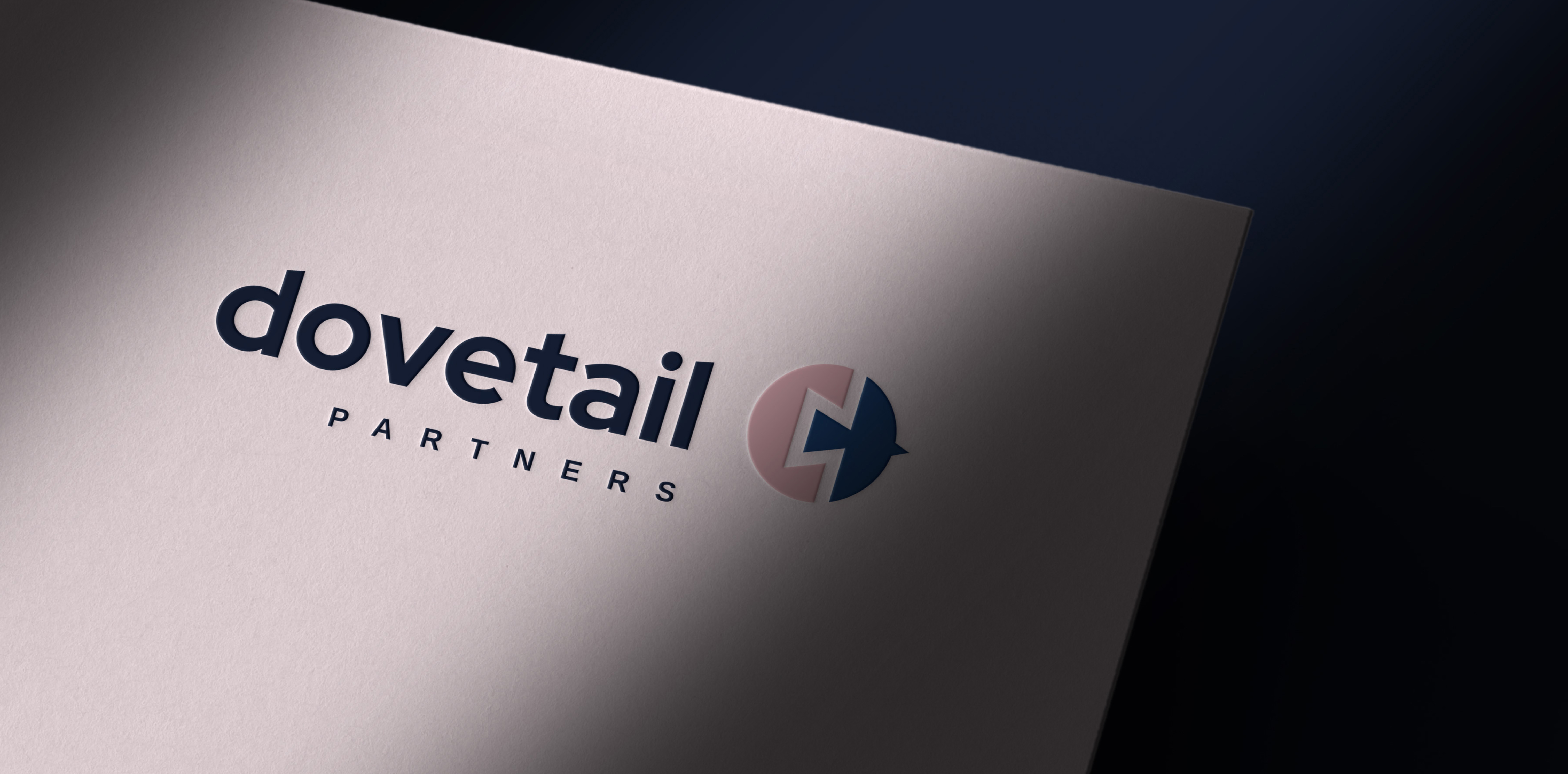
Dovetail Partners
Logo as rebus. The final mark grew out of a combination of two earlier candidates, something that’s usually a questionable idea. The client worked closely with us to work out how the elements could integrate. Lowercase type is less conventional in the PE space and supports a more fluid feeling—as does the pink color, of course.
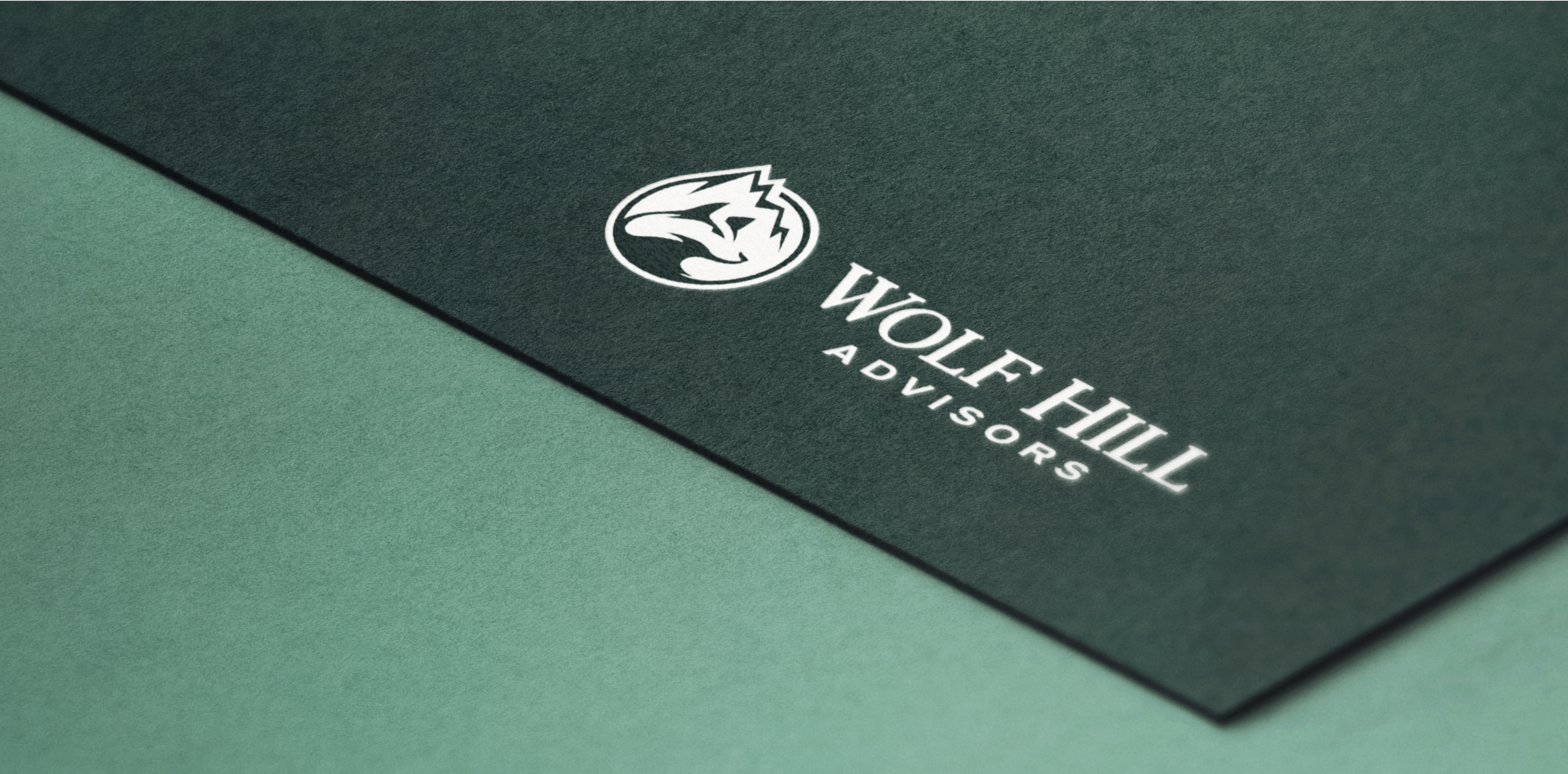
Wolf Hill Advisors
The name and identity for a new investment management advisory firm take inspiration from the street on which the founder grew up. Beyond the relevance of the name, the mark reinforces ideas and values of importance to him, including a connection to nature, the strength of the wolf, and the idea of towering achievement as represented by the mountain peak—visual catnip in the world of Private Equity.
ELH Mgmt.
The ELH MGMT. identity underwent a transformation from hypermasculine and “all business” to a sensibility that was more human as well as more versatile. Less narrowly construction-focused, the new logo supports a broader story about a company that provides a wide range of building- and tenant-related services.
BI Concepts
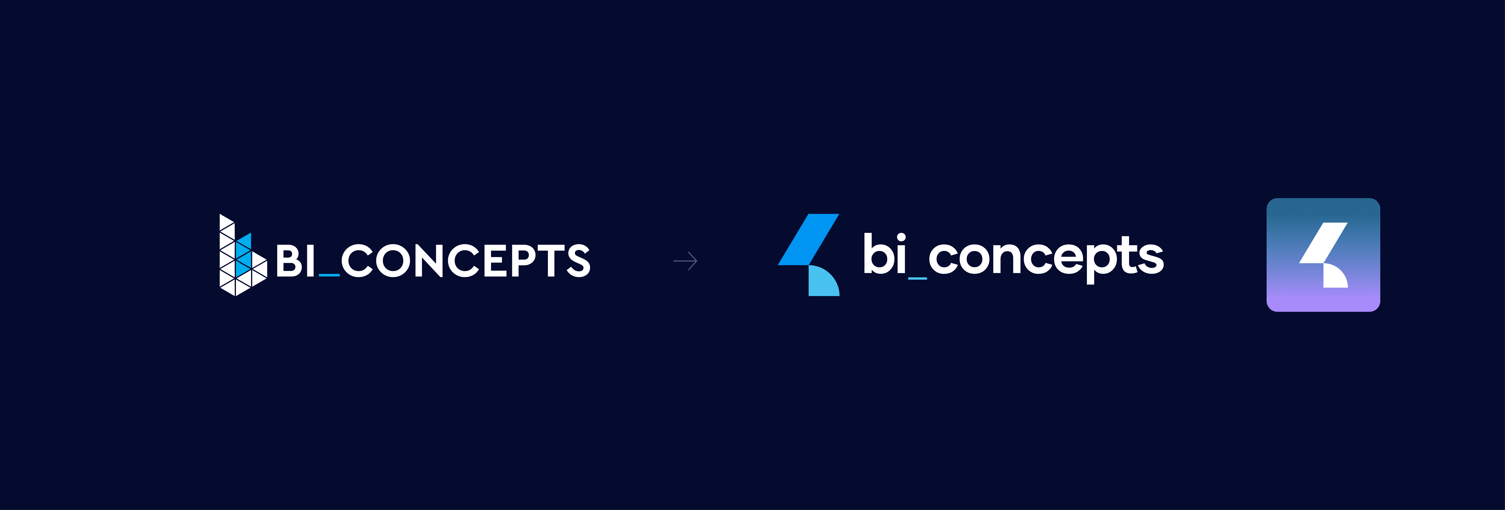
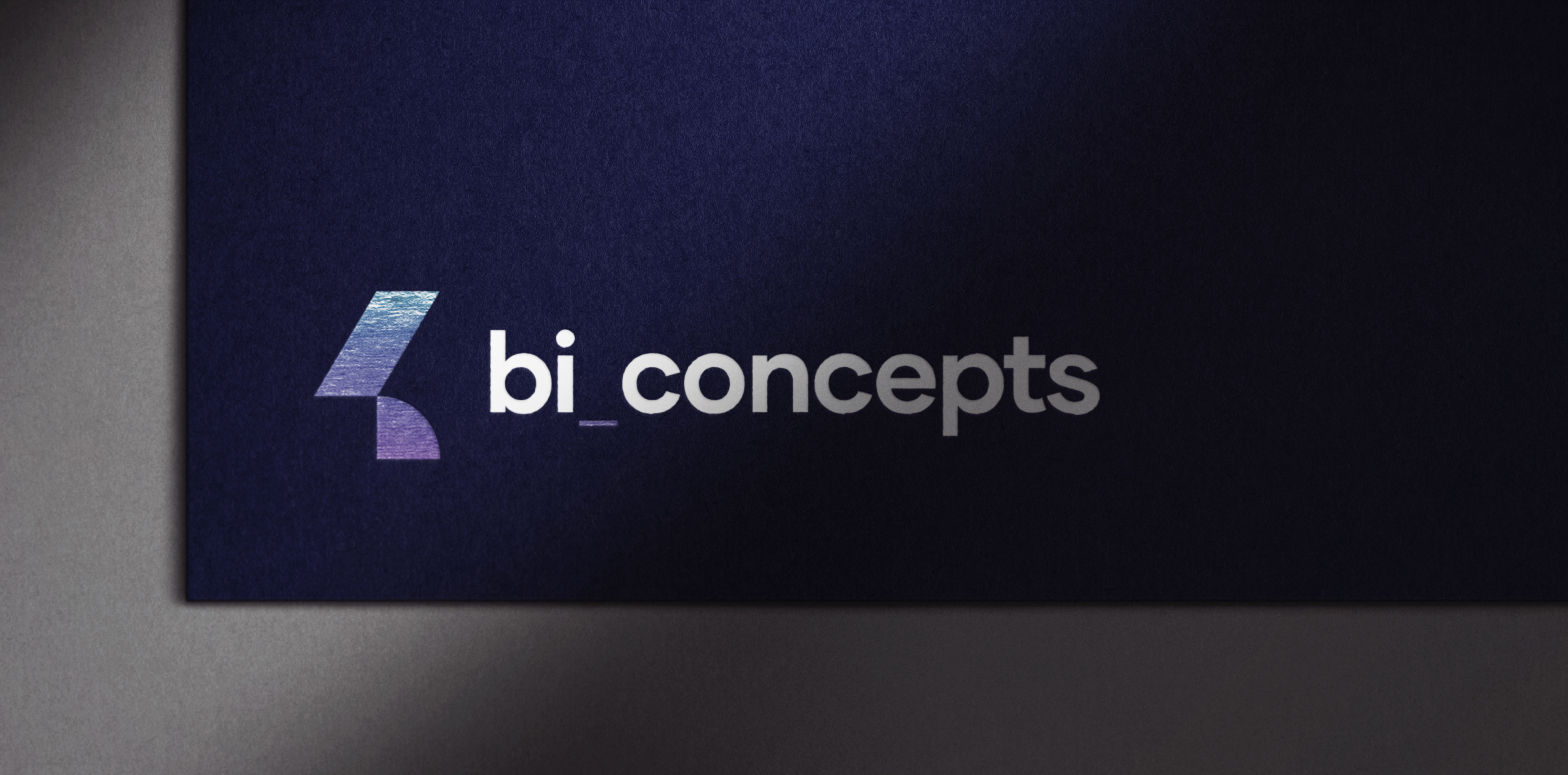
Prioritizing refinement over reinvention, BI Concepts’ new logo takes a minimalist approach that makes it more suitable for digital and print applications. The lower case “b” yields a sense of approachability, while retention of the previous logo’s underscore element continues to reference the company’s connection to technology and information systems. Shifting the color from a dominant purpose to a more subdued blue reinforces the new logo’s cleaner, more modern aesthetic.
Hanna Center
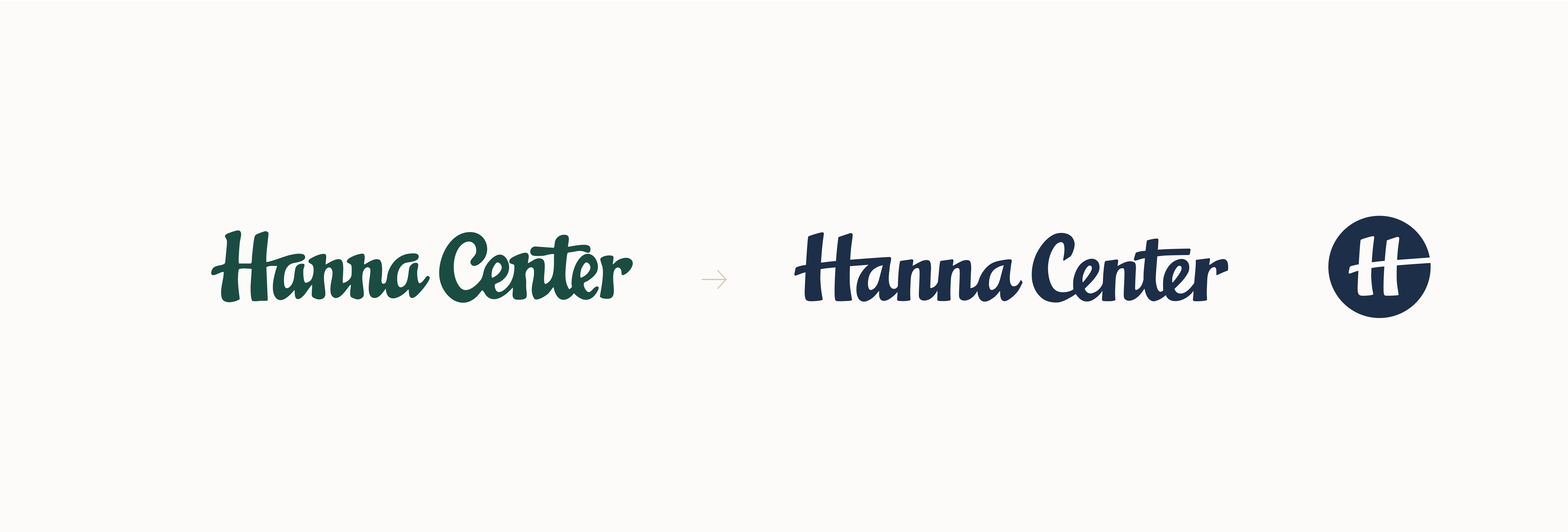
As a respected social services provider, Hanna Center sought to refine its well-known mark while preserving the decades of familiarity it had built. Collaborating closely with Applied Storytelling, Hanna Center’s brand consultant, we helped shape a renewed visual identity.
Applied Storytelling visual strategist introduced an updated mark with meticulously redrawn letterforms that retained the humanistic quality of the original while presenting a cleaner, more sophisticated presence. Later in the process, Ajust proposed a new icon built around the distinctive Hanna Center “H,” allowing the organization to expand its presence seamlessly into social media and other small-format applications.
Stay tuned for more exciting developments as we, together with Applied Storytelling, continue to evolve Hanna Center’s brand through verbal, visual, and digital expression.

The Art & Science of Logo Design
A great logo is like a signature—distinctive, memorable, and deeply personal. Yet, as Paul Rand wisely noted, “The logo, although a most important element, can never tell the whole story. At best, it conveys one or two aspects of the business. The identity has to be supported by a visual language and a vocabulary.”
We approach each logo as a delicate balance of artistry and strategy. Equal parts creative intuition and analytical rigor shape our process—understanding not just what looks striking, but what will resonate with your audiences and stand the test of time. Every curve, color, and letterform is considered through the lens of your firm’s values, ambitions, and place in the market.
A logo is just the beginning. It’s the cornerstone upon which we build complete visual systems that bring your brand to life. When thoughtfully integrated with typography, color, imagery, and other brand elements, a well-crafted mark becomes part of a larger story—one that captures attention, builds trust, and drives real business outcomes.
Next Case
Coming Soon
