Roque Ventures
Shaping private equity consulting
- Branding
- Logo
- Website

Shaping private equity consulting
Roque Ventures stands as a newly established private equity consulting firm, crafted by experts with extensive experience in the field. The founders of the company specialize in financial modeling and valuation, showcasing their proficiency in developing intricate financial models and conducting thorough valuations. Recognizing the significance of a compelling visual brand to represent their specialized expertise, they have entrusted us with the task of crafting a visual identity that resonates with the sophistication and precision inherent in their work.
To establish a distinctive and sophisticated visual identity that reflects Roque Ventures’ prowess in its specialized domain, ensuring prominence amidst a sea of monotonous competitors. To position Roque Ventures as a reliable and principled entity committed to delivering the highest caliber of services.

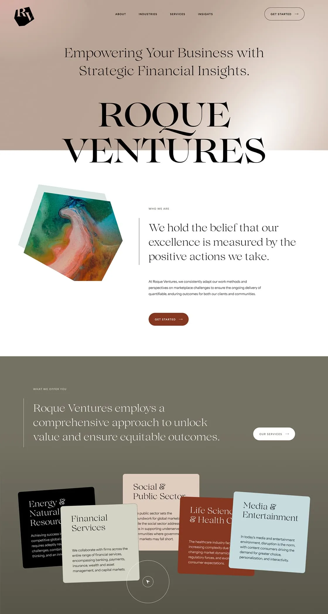
We acknowledged the significant potential of visualizing the intricacies of modeling and valuation in a sophisticated and metaphorical manner. Varied abstract artworks stand as symbolic expressions of the complex dynamics inherent in data and financial market behaviors. These visuals are thoughtfully enclosed within geometrical compositions, emphasizing mathematical precision. To ensure visual consistency and elegance, we integrated abstract graphics in harmonious color tones. The outcome is a contemporary and alluring visual brand.
We meticulously crafted a sleek logotype, employing a modern and sophisticated serif font to exude an air of contemporary elegance. The company’s name abbreviation finds its place within an irregular polygon, adding a touch of uniqueness to the design. The typography, marked by its refined aesthetics, deliberately contrasts with the geometric intricacies of the original polygon figure. Inspired by the radar chart or spider chart—a graphical method for displaying multivariate data—the polygon’s shape symbolizes precision in interpreting complex figures, ability to transform and remodel.

Through creative sessions with our client, we learned that as a new company, they aspire to grab the attention and curiosity of their target audience. Our goal was to challenge the traditional, professional appearance commonly seen in consulting firms. After conducting research and keeping an eye on visual trends, we thoughtfully chose a font that complements the logo. For the color palette, we chose toned-down, earthy shades, breaking away from the monotony of typical industry aesthetics.

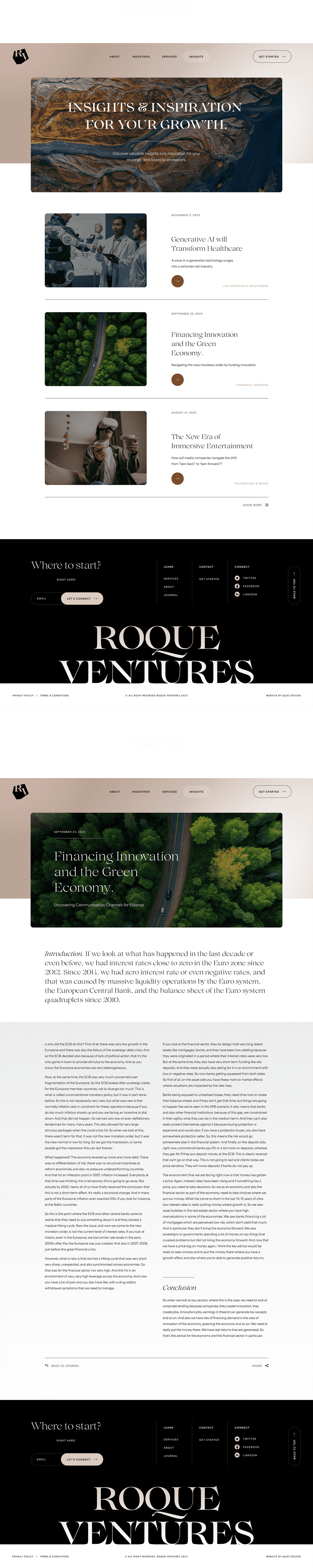
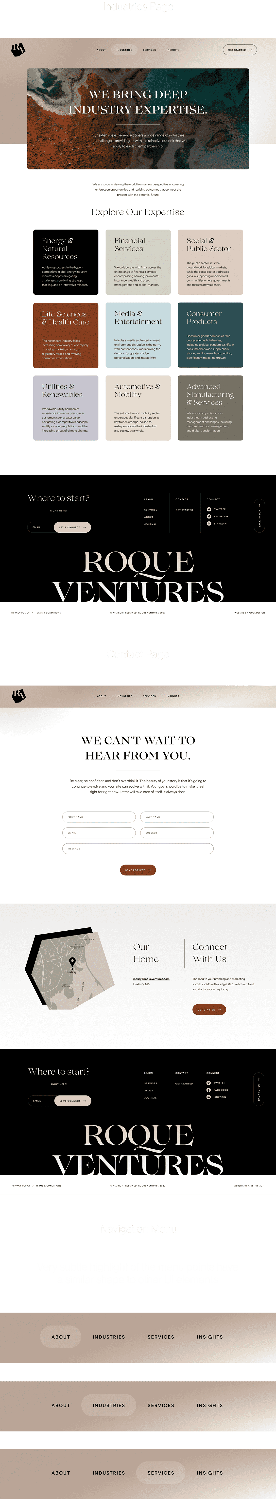
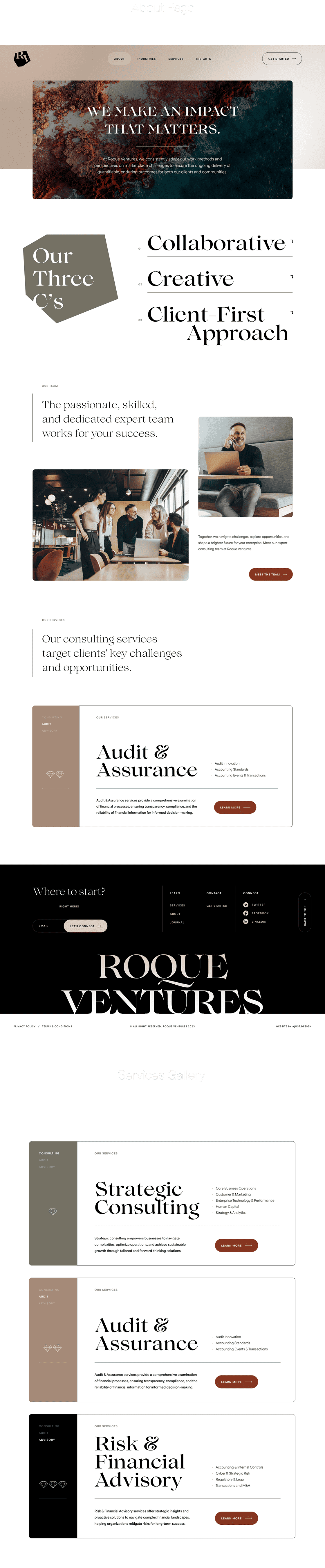
The website, simple in structure and content, demanded compelling and impressive visual solutions from us. We opted for a minimalist design, exquisite typography, an abstract direction for the overall visual aspect, and dynamic color usage. Here, the emphasis lies on creating a visual impact, where we pause for a moment to feel every detail because the design is captivating. Only after that do we delve into exploring the content. The first impression has been successfully delivered!


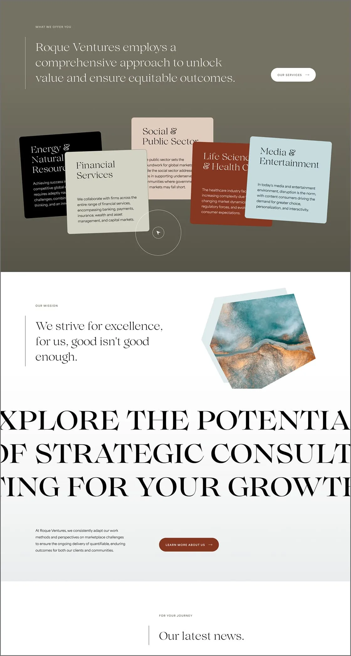
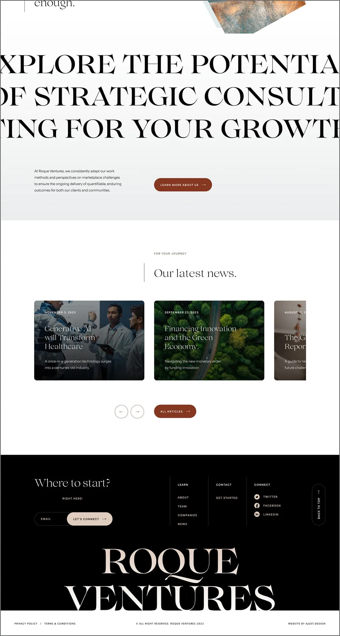
The website design seamlessly integrates all brand elements. With its clean, elegant aesthetic, structured information architecture, and commitment to the best UX practices, the design ensures an excellent first impression and a seamless experience in locating essential information while encouraging engagement.