Sheridan Capital Partners
A compelling view of healthcare through the lens of growth equity


Healthcare private equity demands a delicate balance of institutional gravitas and sector-specific insight. For Sheridan Capital Partners, this meant evolving their brand to reflect both their financial sophistication and deep healthcare expertise.
Our role
Brand visual identity
Website development
Marketing collateral
Location
Chicago, IL
New York, NY
The challenge
During our discovery phase, we uncovered Sheridan’s need to expand reach among diverse constituents while ensuring their visual brand would support both the firm’s present focus and future ambitions. To do so, it needed to speak convincingly to institutional investors and healthcare entrepreneurs alike.

The solution
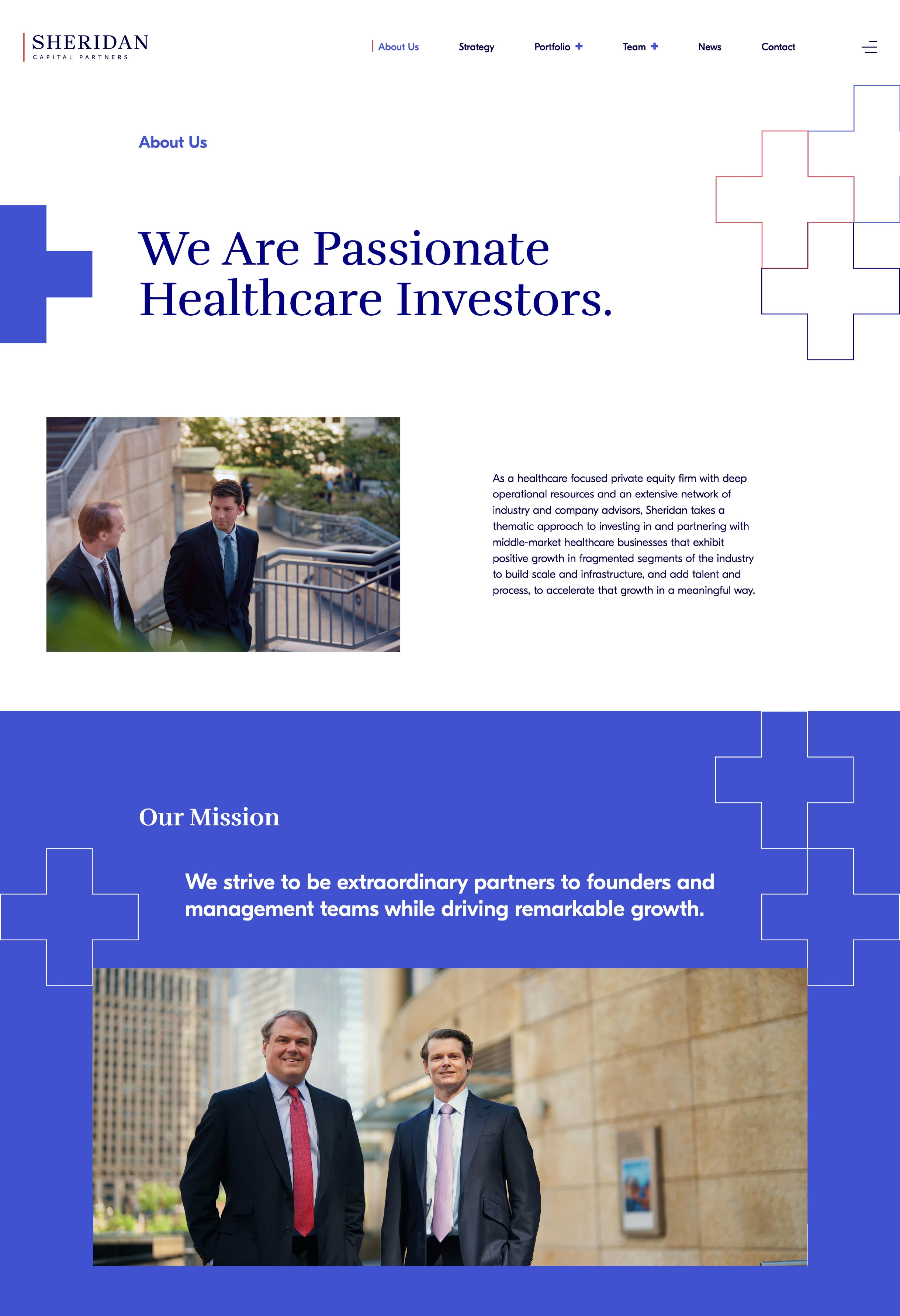
Our solution centered on the metaphor of the cross—in healthcare, the universal symbol of care and trust. In visual design, the cross represents both intersection and convergence. This duality became the foundation for an identity system that supports Sheridan’s story of bringing private equity expertise to healthcare innovation.
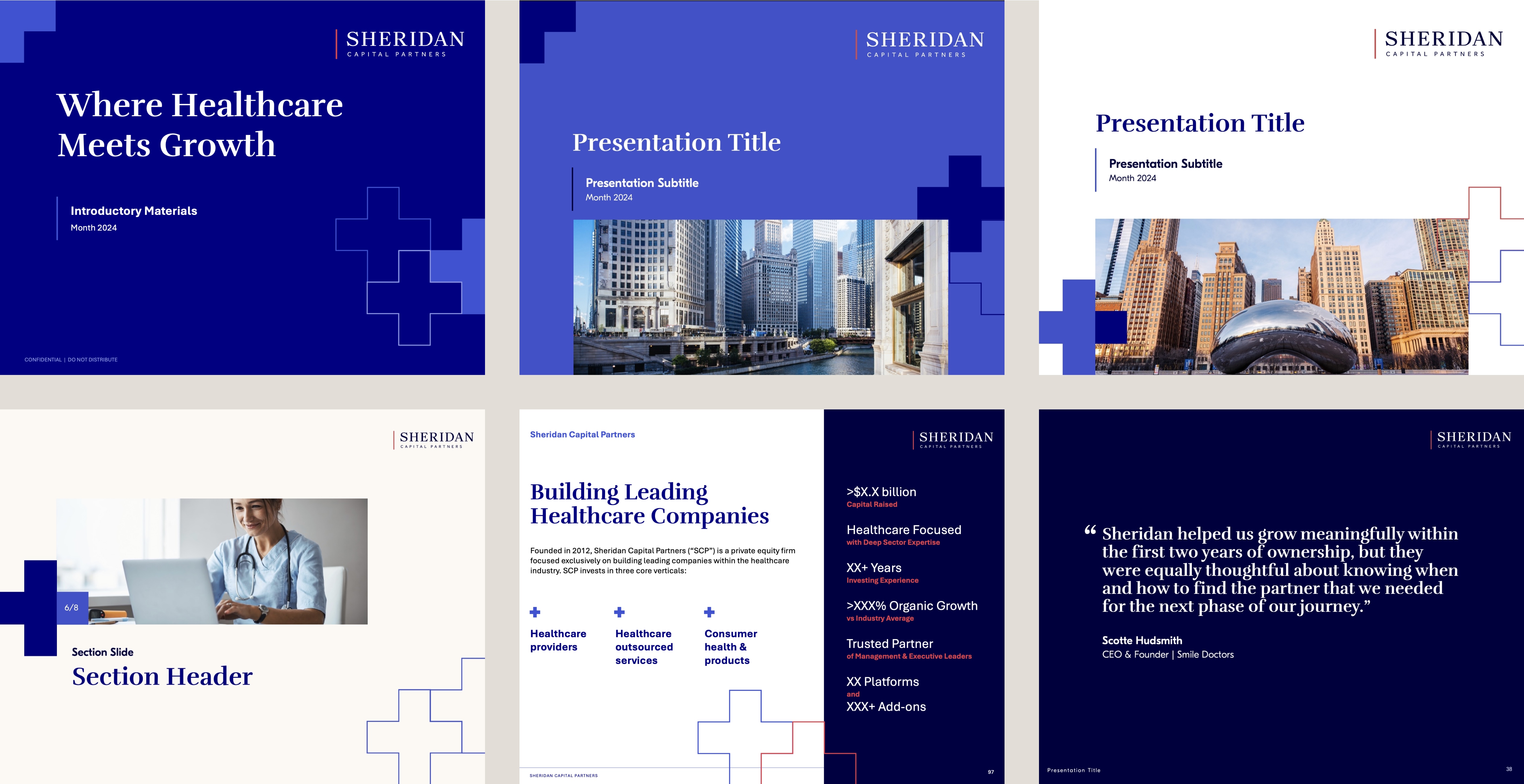
The cross motif manifests throughout the identity, sometimes as a bold graphic statement and sometimes as a subtle background texture. This flexibility allows the symbol to adapt while maintaining its conceptual power—much like Sheridan’s ability to flex between institutional investors and operational partners. This visual foundation evolved fluidly into their current positioning: “Where Healthcare Meets Growth.”
Visual Brand Identity
We developed a comprehensive visual system beginning with a refined identity featuring a cross-pattern as its cornerstone. The system pairs conservative typography with a subtly versatile color palette that bridges healthcare and finance. With a curated a photo library emphasizing patient care, we gave Sheridan a powerful tool for visualizing its efforts to improve patient outcomes.
For photography, we managed the entire process from photographer selection through post-production, ensuring an authentic capture of Sheridan’s collaborative culture. This attention to visual authenticity extended across all touchpoints, from stationery and email signatures to LinkedIn graphics.


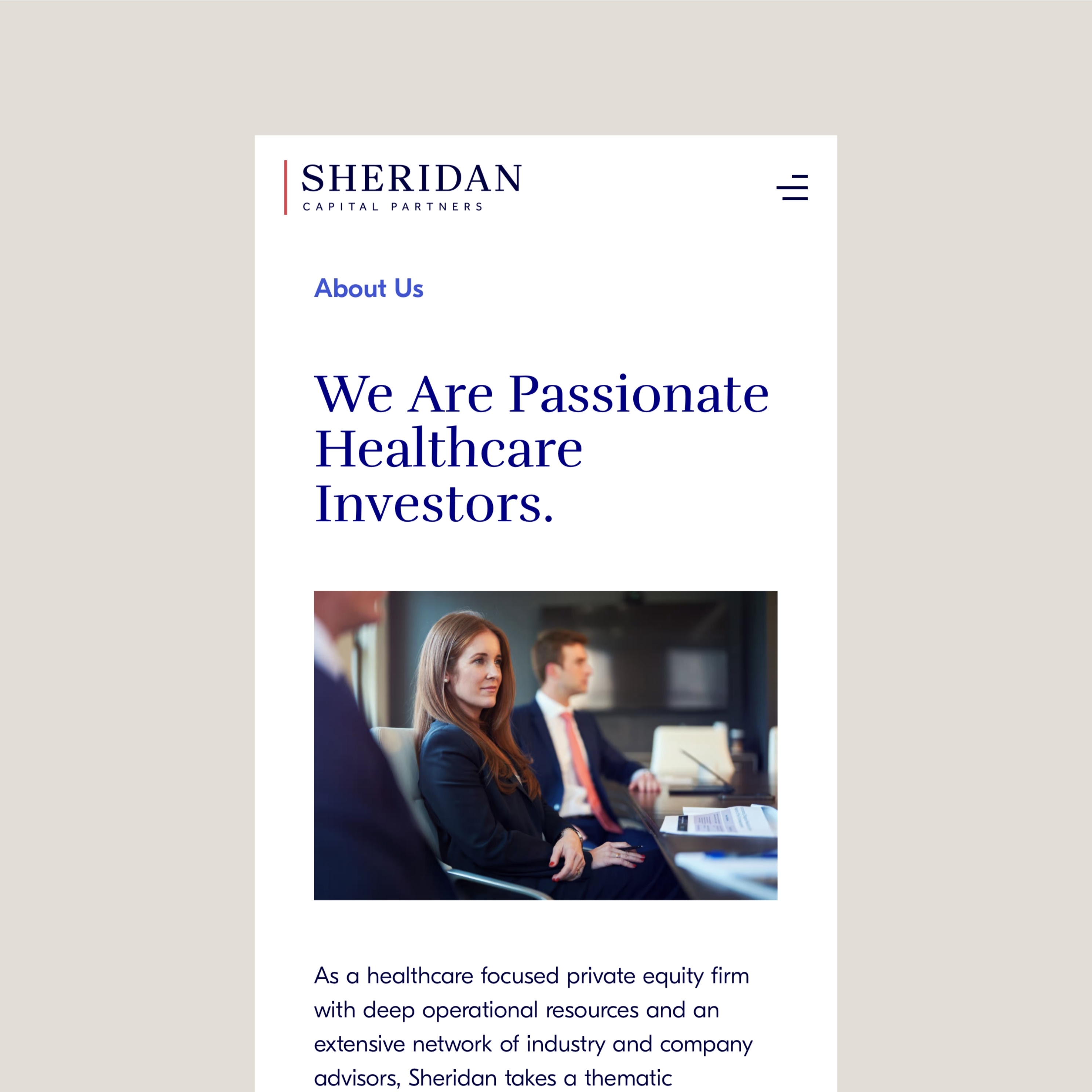
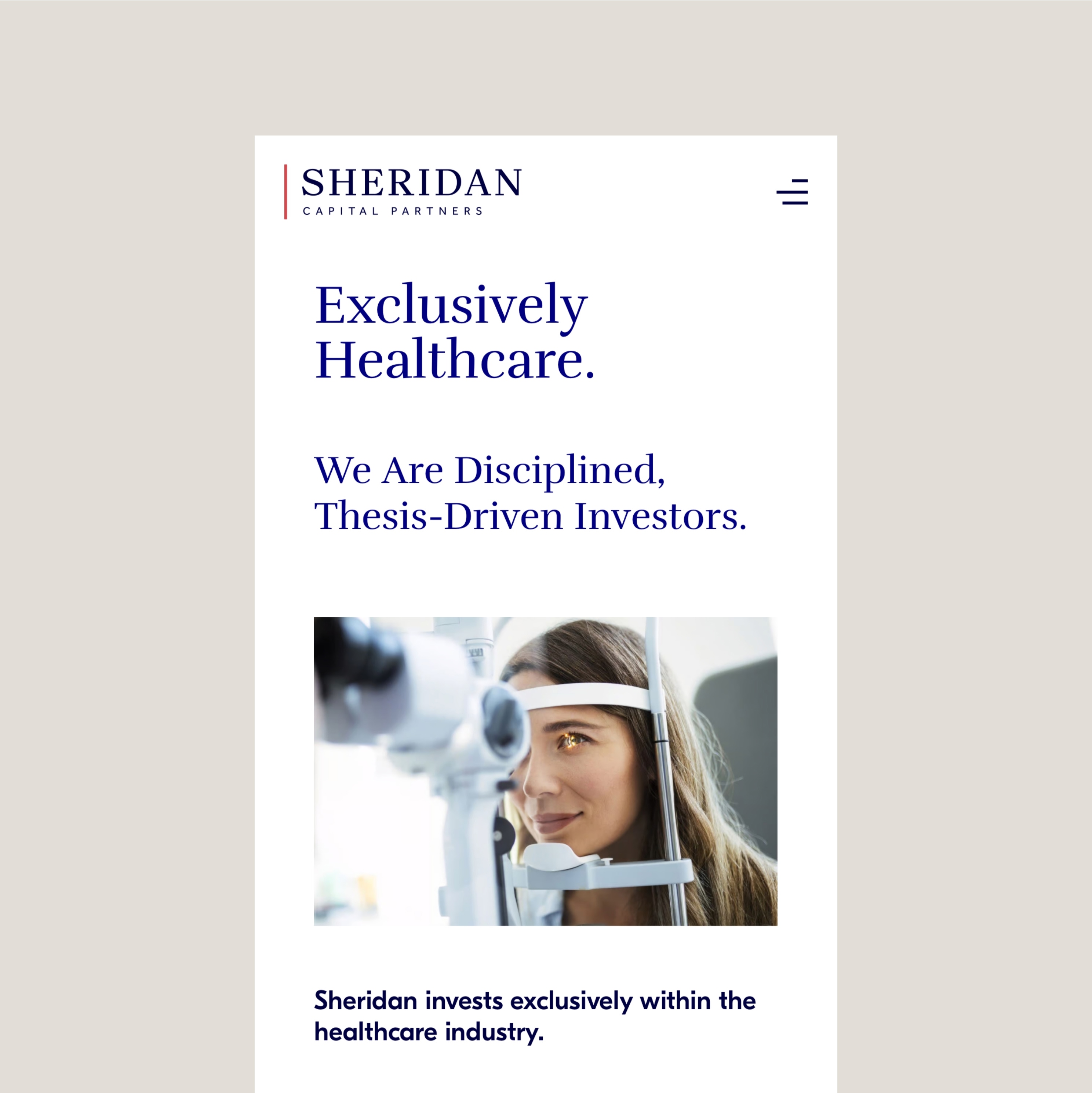
Website
The website translation required particular sensitivity. The architecture we created showcases both institutional credentials and operating expertise. The cross motif guides navigation while reinforcing the brand concept.

Collateral
For investor communications, we delivered a comprehensive presentation system with detailed usage guidelines. Our ongoing partnership includes the creation of tear sheets, customized presentations, and AGM materials—all maintaining the perceptual balance between a sophisticated financial institution and a specialized healthcare partner.
The Outcome
The new identity has transformed how Sheridan appears in the market. Beyond aesthetics, the system has significantly strengthened engagement with the healthcare community and enhanced overall brand perception. The cross motif has become a recognized symbol of Sheridan’s specialized approach, while the system overall provides an intelligent foundation for continued growth.


Project credits
Design & Development Ajust Design
Photography Kris Cheng
Next Case
Coming soon